Free Figma plugin · By UX Hero
VooDoo Maker.A full design system from one color.
Pick a brand color and press Generate. You get 3-layer variables with Light and Dark modes, 12 components with real variants and states, and a spec page for each one, wired the way developers read tokens.
- Cost
- Free
- Components
- 12
- Modes
- Light + Dark
How it works
Three steps, one click.
No setup, no account. Open the plugin in any file, ideally an empty one, and it builds everything on its own pages.
01 · 10 seconds
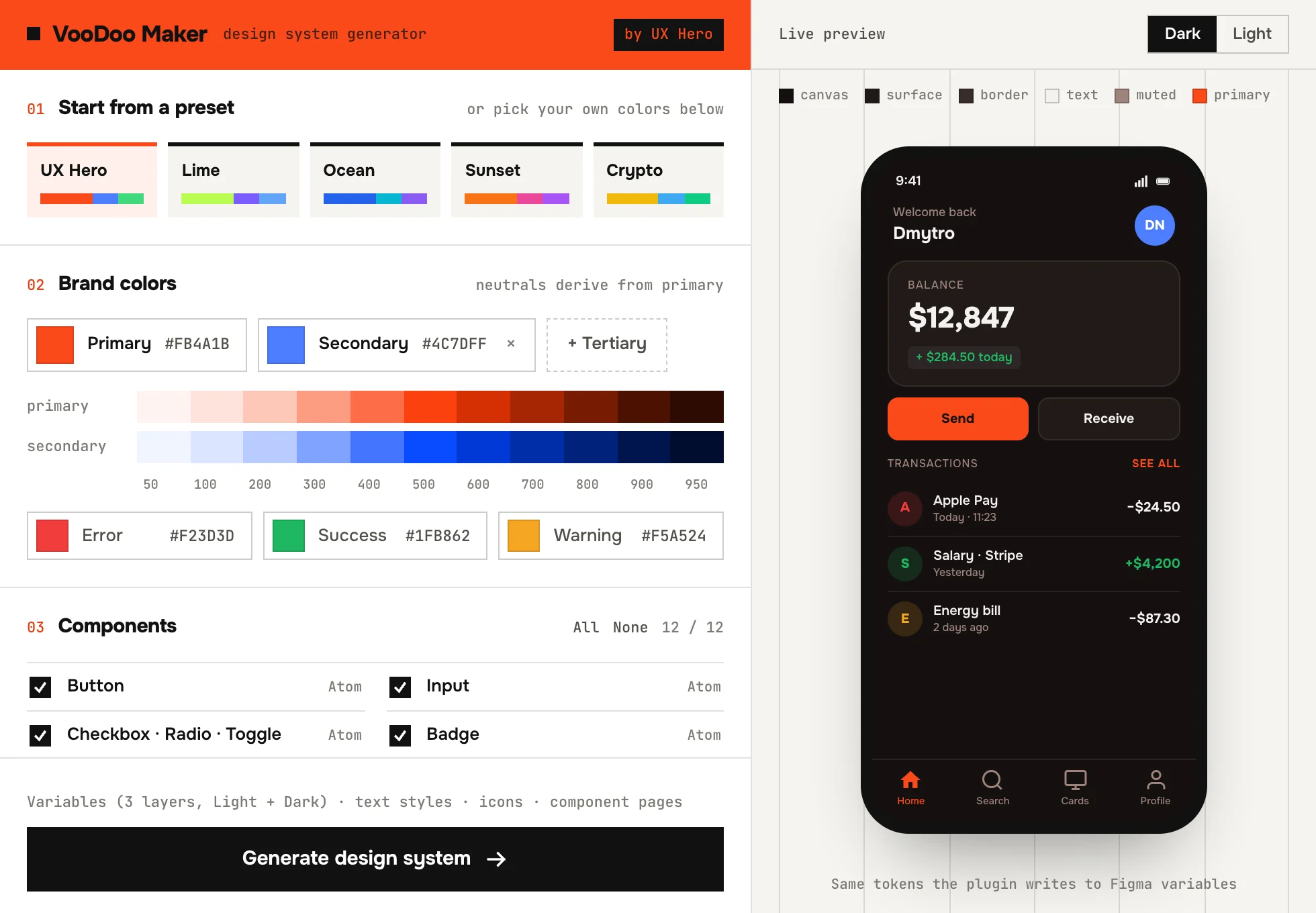
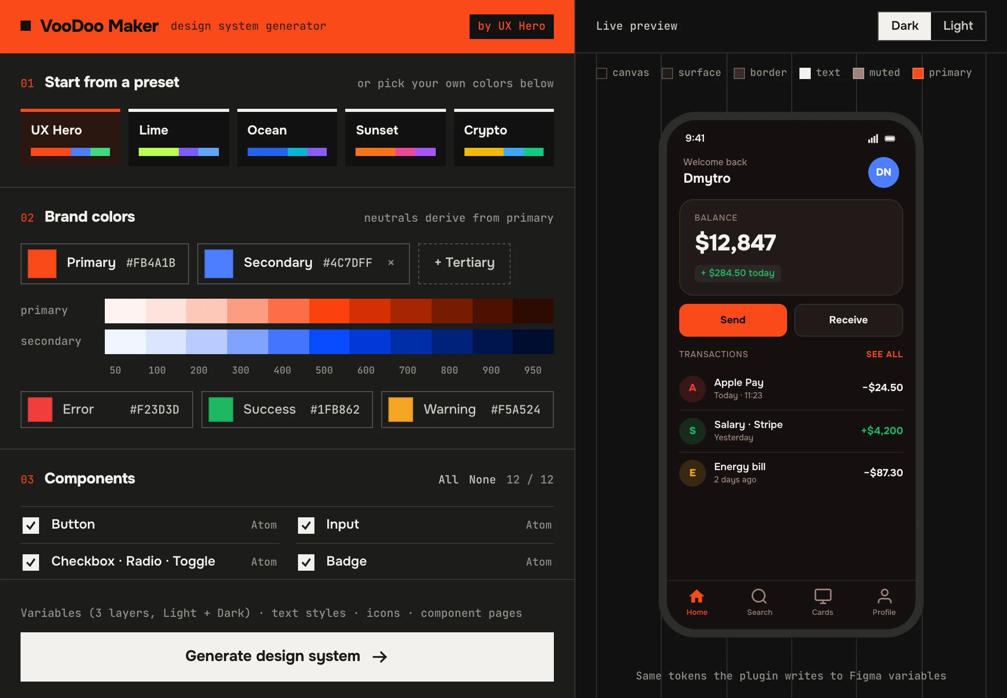
Pick a preset or your brand color
Primary, optional secondary and tertiary, plus error, success and warning. Neutrals are derived from your primary, so the grays feel like your brand.
02 · live
Check it in Dark and Light
A phone preview updates as you pick, using the same color math the plugin writes into variables.
03 · about a minute
Choose components and generate
Select any of the 12 components. Run it again any time: the plugin replaces only the pages it created and never touches yours.
What you get · 1
Variables in three layers.
Primitives hold raw values, semantic tokens hold meaning per mode, component tokens point to semantic ones. Change the brand in one place and everything follows.
Primitives
11-step ramps for primary, neutral and status colors, plus spacing and radius.
- primitives/primary/50
- primitives/primary/200
- primitives/primary/400
- primitives/primary/500
- primitives/primary/700
- primitives/primary/950
Semantic
bg, text, border, action and status tokens. Light and Dark are modes of one collection.
- semantic/bg/canvas
- semantic/text/primary
- semantic/border/default
- semantic/border/focus
- semantic/action/primary/default
- semantic/status/success/text
Component
What the parts actually use, so a developer can map a token to a prop one to one.
- component/button/primary/bg/default
- component/button/primary/bg/hover
- component/button/primary/text
- component/input/border/focus
- component/input/border/error
- component/card/border
What you get · 2
12 components with real variants and states.
Variant axes Type × Size × State, component properties for labels and icons, swap-able vector icons, focus rings as real shadows and disabled states through tokens, not opacity.
| Component | Variants and properties |
|---|---|
| Button | Type: Primary · Secondary · Ghost · Danger × Size SM · MD · LG × 5 states. Label and left/right icons as properties. |
| Input | Text · Search · Password, Label + Field + Hint, error and focus states. |
| Checkbox · Radio · Toggle | Value (Unchecked · Checked · Indeterminate) separate from interaction state. |
| Badge | 5 colors × 2 sizes, dot and removable options. |
| Avatar | Initials · Image · Icon, XS to XL, online dot. |
| Spinner · Skeleton | 270° arc spinner and skeleton text / card, 3 sizes. |
| Card | Default · Interactive · Stat with Hover and Selected. |
| Table row | Checkbox, avatar, 2-line cell and trailing actions. |
| Toast · Alert | Info · Success · Warning · Danger with action and close. |
| Tooltip | Top · Bottom · Left · Right with a real arrow. |
| Tabs · Segmented | 4 styles, active tab 1 to 3. |
| Modal | SM · MD · LG · Confirm built from real Button instances. |
VooDoo Maker gives you the start. The course takes it to code.
Course in Ukrainian · Design System + AI
Build your own design system the way product teams do: tokens from Figma, components with every state, Storybook, and Claude that keeps the system in order. 7 days, self-paced, with a workbook.
See the courseNot ready for a course? Get new scripts and live streams in Telegram
Questions you'll have
FAQ.
Is it really free?
Yes. Free, no usage limits, no account. The course is the paid product.
Does it send my file anywhere?
No. It runs fully offline inside Figma. No network access, no tracking.
Will it break my existing file?
It adds its own pages and a variables collection. On a re-run it removes only the pages it created earlier. Still, the cleanest result is in a new or empty file.
Can I use my own brand colors?
Yes. Start from a preset or set primary, secondary, tertiary and status colors by hand. Neutrals are generated from your primary.
Can developers use the tokens?
That is the point of the three layers: component tokens map to props, semantic tokens map to CSS variables per theme. The course shows how to take them to code and Storybook.
Who built this?
Dmytro Nikolaienko · Product Design Lead, 15 years in fintech and crypto, founder of UX Hero. Same person behind Code Runner, the courses and the YouTube channel.
One color in
A design system out.
Free Figma plugin. Install in 30 seconds, generate in about a minute.
Install VooDoo Maker